Case study
Redesigning the yeep.me Download Center
And making it easier to use and maintain.
Overview
As a Product & UI designer at Cibox, I undertook the redesign of the YEEP.ME Download Center website to make it easier for customers to find product documentation, to facilitate site maintenance, and to reduce the site's carbon footprint.
Challenges
- Long product list and lack of search feature made the website hard to use
- Page by page approach made the website hard to maintain
- WordPress was deemed too heavy on the server, and the page had a high carbon footprint
Solutions
- Introduced search & filter features, modernized UI
- Built an automated updating system to facilitate the maintenance
- Remade the website using only HTML, CSS and a pinch of JavaScript
Key results
-58%
carbon emissions
50%
faster search
Client
CIBOX INTER@CTIVE
Role
UI/UX Design, Visual Design, Programming, Deployment testing.
Tools
HTML, CSS, JavaScript, Python, JSON, Git
BACKGROUND
What is yeep.me Download Center?
YEEP.ME is a brand of CIBOX INTER@CTIVE, an e-bike and e-scooter manufacturer.
The YEEP.ME Download Center is a website where YEEP.ME customers can find the documentation for their products, as well as confortmity certificates and warranty conditions.
It needs to be updated either when a new product is released or when a correction needs to be made to a document.
PROBLEMS
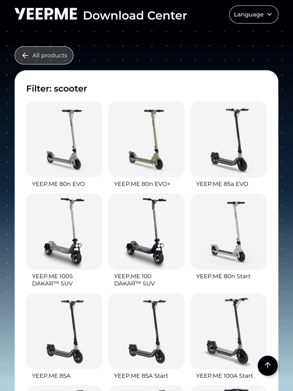
An endless product list
The website featured a landing page with a 3-column list of all the products of the brand that ever existed. The only way to search for a product was to scroll through the list and find it by name or picture. On mobile, the list became a single, long column, requiring even more scrolling.
The product pages featured a large table that allowed users to search the documentation in multiple languages. If there were more than three types of documents, the table had to be scrolled from left to right, even on desktop. Needless to say, the mobile experience was worse.
Furthermore, maintaining the website was difficult. When adding a product, a new page had to be created by duplicating an existing one and editing the information. Then, the documentation had to be uploaded, and the PDF links had to be edited individually. Finally, the product had to be added to the list on the homepage, along with a link to the previously created product page. This whole process was long and tedious.
Finally, the website was heavy on the server due to its use of WordPress, and its carbon footprint was enormous. Beacon graded it an F, with an astonishing 1.101g of carbon emitted per page view.
GOALS
Less scrolling, faster everything
1. A faster, cleaner way to search for products, reducing curstomer frustration.
2. Simpler maintenance. Adding documentation shouldn't be harder than a drag-and-drop.
3. Lighter website = less carbon emissions and better performances.
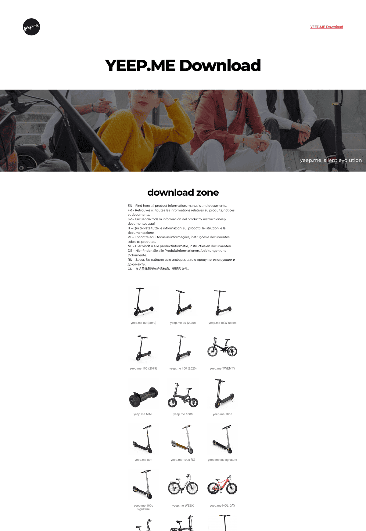
The homepage in 2024, before redesign
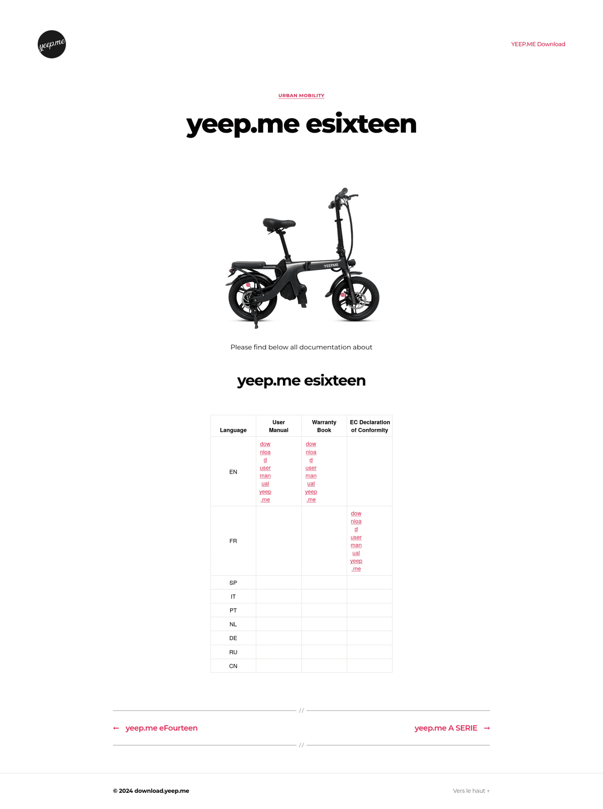
A product page in 2024, before redesign
The solution

Less clutter, more features.
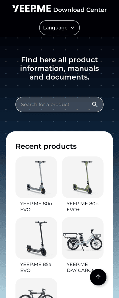
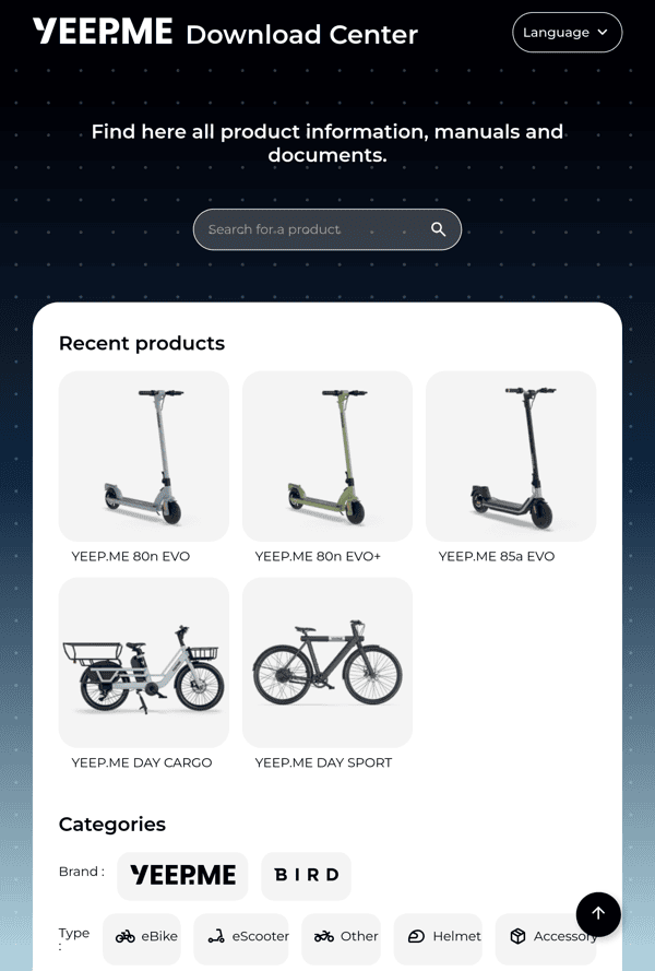
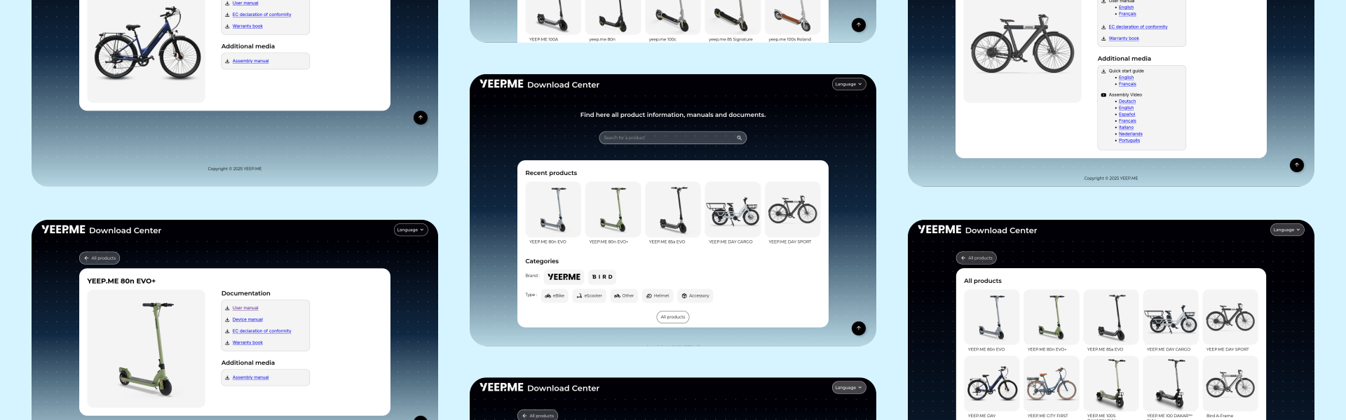
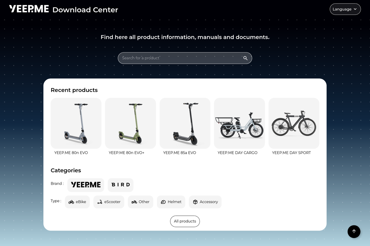
A single line of products.
Product documentation is needed either right after buying a product or when a problem occurs. Since problems are usually unpredictable, the first line showcases the most recent products for quick access, which provides a great first experience for new customers.
Search!
This was an obvious missing feature in the previous design, so I added it! This search box uses JavaScript to display all the products matching the searched character string in real time.
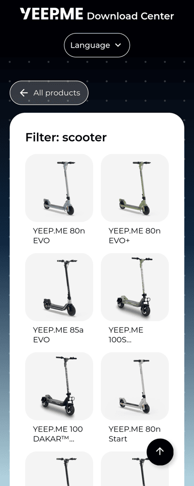
Filters!
Sometimes you don't know the name of your product, so filtering by what you know might be useful. Static filtered pages also come in handy for users with JavaScript-blocking extensions, such as NoScript.
Same information, but clearer
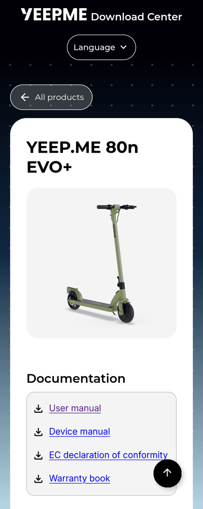
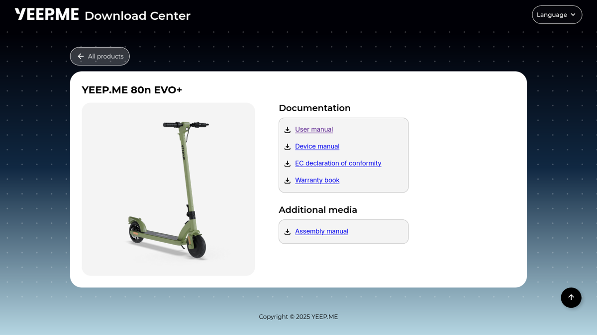
A simple document list
Instead of a large (and mostly empty) table, the documents are now presented as a simple list, with only what's available for shorter scrolling and better readability in general.
Localization
Since the brand sells in multiple countries, the website is now available in English and French, with the option to add more languages later.
Custom solution
A static website generator
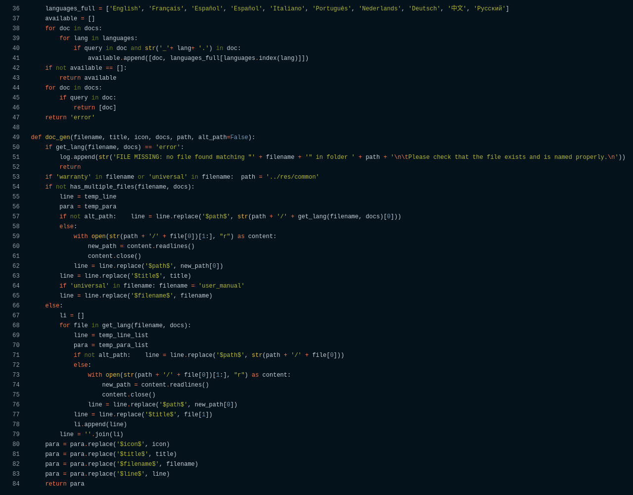
Since I had to get rid of WordPress for being too heavy, I went for bare HTML pages. Of course, I had no intention of creating hundreds of HTML pages by hand, so I wrote a Python script that scans all the products in a folder and then generates all the web pages with the correct information.
Drag-and-drop page generation
Since there is no way to know if my future coworkers will have the necessary skills to edit HTML, I made it so that creating and editing a page is now only a matter of dropping files with the correct names in a folder, filling in product info, and pressing a button on a PHP web interface to update the website in a few seconds!
Lighter on the planet!
Switching to HTML with minimal JavaScript halved the homepage size and the associated carbon emissions! The website now uses fewer server resources and is lighter on the planet!